Deprecated: Array and string offset access syntax with curly braces is deprecated in /home1/martha/public_html/trumpetvine.com/wp-content/themes/trumpetvine/includes/functions-kubrick.php on line 92

Deprecated: Array and string offset access syntax with curly braces is deprecated in /home1/martha/public_html/trumpetvine.com/wp-content/themes/trumpetvine/includes/functions-kubrick.php on line 92

Deprecated: Array and string offset access syntax with curly braces is deprecated in /home1/martha/public_html/trumpetvine.com/wp-content/themes/trumpetvine/includes/functions-kubrick.php on line 92

Deprecated: Array and string offset access syntax with curly braces is deprecated in /home1/martha/public_html/trumpetvine.com/wp-content/themes/trumpetvine/includes/functions-kubrick.php on line 92

Deprecated: Array and string offset access syntax with curly braces is deprecated in /home1/martha/public_html/trumpetvine.com/wp-content/themes/trumpetvine/includes/functions-kubrick.php on line 92

Deprecated: Array and string offset access syntax with curly braces is deprecated in /home1/martha/public_html/trumpetvine.com/wp-content/themes/trumpetvine/includes/functions-kubrick.php on line 92

Deprecated: Array and string offset access syntax with curly braces is deprecated in /home1/martha/public_html/trumpetvine.com/wp-content/themes/trumpetvine/includes/functions-kubrick.php on line 93

Deprecated: Array and string offset access syntax with curly braces is deprecated in /home1/martha/public_html/trumpetvine.com/wp-content/themes/trumpetvine/includes/functions-kubrick.php on line 93

Deprecated: Array and string offset access syntax with curly braces is deprecated in /home1/martha/public_html/trumpetvine.com/wp-content/themes/trumpetvine/includes/functions-kubrick.php on line 93

Deprecated: Array and string offset access syntax with curly braces is deprecated in /home1/martha/public_html/trumpetvine.com/wp-content/themes/trumpetvine/includes/functions-kubrick.php on line 93

Deprecated: Array and string offset access syntax with curly braces is deprecated in /home1/martha/public_html/trumpetvine.com/wp-content/themes/trumpetvine/includes/functions-kubrick.php on line 93

Deprecated: Array and string offset access syntax with curly braces is deprecated in /home1/martha/public_html/trumpetvine.com/wp-content/themes/trumpetvine/includes/functions-kubrick.php on line 93
Trumpetvine Travels Archive

Author Archive

One Year Blog-o-versary!   December 1st, 2007

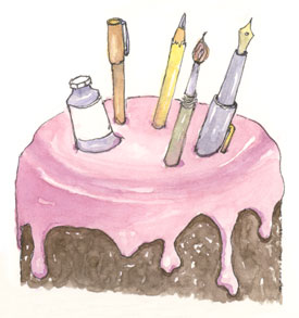
Well it’s happened: I have been at this for a full year!

sketch_birthday_cake

The experience has been so different and so much more amazing than I ever expected: I am just stunned. Most especially wonderful are all of the great people I have met, both online and in person, as a result of this endeavor.

Because I played around with the blog before publicly announcing it the actual anniversary date is murky. I have decided on today because it was one year ago when I received my very first comment, and from the wonderfully inspiring Jana Bouc no less. Jana’s blog was influential in getting me started on this adventure in the first place, and I have since had the pleasure of sketching with her as well.

Some facts and figures for the year:

Number of posts: 65
Number of sketches posted: 159
Number of email subscribers: 192
Number of RSS subscribers: 252
Number of comments: 838
Number of comment spams: 15,342

It’s been a crazy whirlwind of a year. When I started the blog I hoped that it would get me sketching more, and it certainly has done that. I had no idea though how much work it would be or how hectic it would sometimes make my life. But I also didn’t expect the community, encouragement, new directions and immense satisfaction it has brought to me.

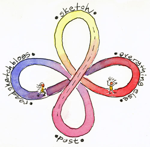
sketch
The Crazy Life of the Sketchblogger (larger)

I would like to extend a heartfelt
    * T H A N K   Y O U *
to the sketchblog community: fellow bloggers who inspire me every day, the many wonderful people who leave encouraging comments and emails, and all the folks out there who come by for a visit now and then or read via the RSS feed or the EDM Superblog. It is the human connection of this experience that has been the best reward of all.

And now, I’m off to drink a glass of champagne 🙂

❀   ❀   ❀

An Interview with Author Mari Le Glatin-Keis   November 29th, 2007

sketchbook_costa_rica
Mari's Costa Rica Sketchbook

After recently reading the new book The Art of Travel With a Sketchbook I wanted to know more about the author, Mari Le Glatin-Keis. I was fortunate to be able to correspond with her by both email and phone, and discovered that she is very enthusiastic about the joys of travel sketching.

photo_mari
Mari
Sketching

Martha: What kind of sketching do you for your own enjoyment?

Mari: Sketching is amazing, isn’t it? I find myself sketching whenever I travel; everything I see stimulates me to record. My sketchbook pages are all I have to carry memories, as I don’t take photographs. At home, I don’t sketch every day but I always carry a small sketchbook and pencil on my walks and bicycle rides. Even if I do not use them I like to have them on hand. When I don’t have my sketchbook, I sketch with my eyes; I literally use my eyes as if they were pens or brushes.

Martha: What are your preferred sketching tools?
Mari: The more I sketch, the less I seem to need and the smaller my sketchbooks become. These days I use:

  • 6 x 8 inch Pentalic sketchbook, not too small, not too big
  • 0.7 mechanical pencil
  • small watercolor set, a kid’s set or whatever is on hand
  • 2 brushes, one big and one small
  • a few color pencils and pastels
  • glue stick

Voila: the simpler, the lighter, the better!

Martha: You travel quite a bit then?
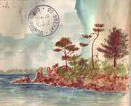
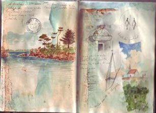
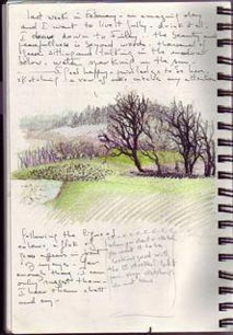
sketchbook_bretagne
Mari’s Bretagne
Sketchbook
(full page)
Mari: Yes, I grew up in France and each year I spend time there, here in the US, and also in Mexico. My travel workshops give me the opportunity to keep a balance between continents but I feel at home wherever I happen to be. I am living primarily in Oregon right now and every time I come back to Corvallis I jump on my bike and ride towards the coastal range with a smile on my face. I am here right now and it is beautiful, even as we move into winter.

I have always been a sketcher and a traveler. I met my husband Dick in Ecuador 30 years ago when I was making my way through South America sketching plants and flowers. Back then sketching was already my life and expression, my “raison d’être” as I moved deep through the Andes and the Amazon, amongst the local people. Sadly, I later lost those four years of recordings in a shipwreck in 1978 (another long story!) and that was that. It was my first big lesson in “letting go” and about the ephemeral side of life.

Martha: What prompted you to write The Art of Travel With a Sketchbook?
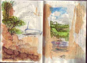
sketchbook_estuary
Mari’s Estuary
Sketchbook

(full page)
Mari: In years of leading sketching workshops I have seen people of all ages, with no art training, becoming bold, confident and expressive. I hoped to share what I have witnessed and encourage more people to sketch.

I wanted to tell people how sketching can save your life as it saved mine! Sketchbooks are more valuable than any finished piece to be hung on a wall as they contain your first emotions and your own interpretation of a moment or a situation. When sketching we are open to the world outside us, we forget about pains and worries, and are totally in the moment.

I also wanted to encourage people to have a deeper travel experience by observing cultural details and local people more closely. In many countries traveling with a sketchbook will set you apart from a regular tourist. Often I remind my participants that if traveling with a sketchbook is about recording life as it is, wherever we are, then we should allow our pages to reflect what we see. For example, when I look at my many sketchbooks from Oaxaca in the eight years I went there, I can see what was coming. The tension, the increasing contrast between the rich and the poor, it is all there in my pages.

Martha: How did you go about publishing the book?
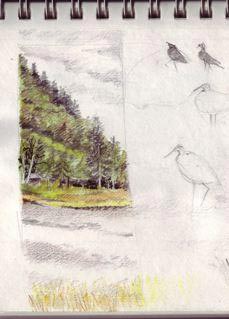
sketchbook
Mari’s Summer
Lake Sketchbook

(full page)
Mari: I met my publisher Suzanne McNeil in one of my workshops in Oaxaca. She was enthusiastic about the book and upon coming back from my travels I had a contract waiting for me.

Although I have created other books, this was the first time I had to write the full text as well as illustrate. This was a new challenge, especially since English is not my first language. Making the entire book took a year and a half of intense work. I even created pages in my sleep!

But the real hardship came when the designer asked me put my mockup on the computer. Until then, when laying out pages for a book I manually cut and pasted the pages and I loved that process. Layout on the computer was very different. A friend and workshop participant, Dianne Roth, saved me when she volunteered to help me transfer my hard copy onto the computer.

Martha: You’ve included quite a bit of student work in the book?
photo_mari
Mari’s Bretagne
Sketchbook

(full page)
Mari: Yes, I always knew that if I was going to make a book on sketching I had to give my participants a voice. Only they could illustrate the approach. Over 20 participants volunteered to share their sketchbook pages and write about their experiences.

In workshops I see people re-discovering the “child” in themselves and playing, and I always feel privileged to witness their transformation. I am totally amazed by their spontaneity as, without any hesitation, they lay down the most innocent lines in their sketchbooks. I often envy my participants for their pure and spontaneous renderings: I am still trying to let go of the heavy training I received in art school!

Martha: What other books have you done?
sketchbook_oregon
Mari's Oregon Sketchbook
(full page)
Mari: In art school I studied printmaking and I have always wanted to be a book illustrator. I love to illustrate people’s lives and words. In 1997, a couple of weeks after returning from a two year stay in Provence with my family, Margaret Anderson asked me to illustrate her story Children of Summer, based on the insect world of Jean Henri Fabre. I loved the whole process, working with Margaret and drawing the fascinating world of insects.

Meanwhile, I was sending my sketchbooks to French publishers. In 1999, Equinoxe offered me a contract to publish my travel sketchbooks: a dream come true! Four sketchbooks that I had already created, with no publication in mind at the time, were published as books. A fifth sketchbook, Balades a travers l’Armor et l’Argoat, was a new assignment.

I also created a daybook, Mon Jardin Jour après Jour, in 2001. Day after day I went out in my small garden here in Oregon, a sketchbook in one hand and a pencil in the other, and I recorded all the changes I saw throughout the year. I loved the process of creating that book!

Martha: Reproductions of travel sketchbooks are especially popular in Europe then?
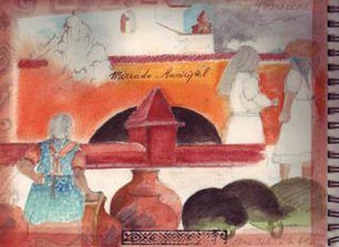
sketchbooki
Mari’s Mexico
Sketchbook

(full page)
Mari: In Europe the market is flourishing, and publishers are eager to meet traveler-artists to publish their sketchbooks. The sketchbooks describe not only the beauty of the places they travel through but also the social and political climate, and are most often about far away places. These books are used quite a bit in teaching as well. The focus though is on artists who are of professional standing and their work is fairly polished. It’s not something that non-artists are encouraged to try.

It was seeing more and more of these “beautiful” art travel books on the shelves, and remembering the real miracle of the expression taking place over and over right in front of my eyes during workshops that motivated me to write my new book. I knew I had to tell people that if they wanted to sketch too, they could!

Martha: How do you teach Travel Sketching?
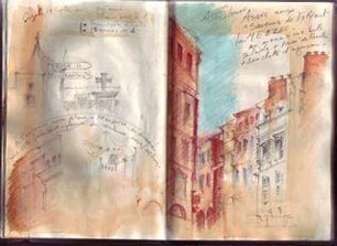
sketchbook_bretagne
Mari’s Toulouse
Sketchbook
(full page)
Mari: I don’t teach; I encourage people to take visual notes. I give them tips to help them launch into this great adventure of recording whatever they see wherever they are, either at home or traveling.

You do not learn “how to” sketch, you sketch. In travel sketching there is no right or wrong, no rules or recipes. Words, lines, colors, collage: use anything you have on hand to express yourself. In sketching it seems like the less technique you know the better you are. Many of us have to gain confidence in ourselves before learning skills. It is all about trusting. If we put our expectations and our critical mind aside, beauty will come through.

Martha: What workshops are you planning for 2008?
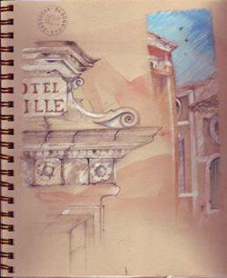
sketchbook_provence
Mari’s Provence
Sketchbook
(full page)
Mari: Next year I will be leading workshops in the US, France and Mexico. All of my workshops take place in visually and culturally stimulating environments. For 5, 8 or 10 days, my participants can totally relax, play and dedicate their time to exploring the wonders of sketching.

I’ve created three workshops in the Pacific Northwest for next year, each in a unique environment. Wherever we are there is culture and beauty to record in our sketchbooks and I am really happy to develop such workshops here in the US.

Nevertheless, I keep going back to the two regions of France I know best: Brittany, where I grew up, and Provence, where I lived from 1992-94. In 2009, I will add Le Lot to my destinations. It is a part of France that I have been discovering over the years and I feel I know enough of the region now to share its wonders with my participants.

I am also about to travel to Mexico to make final plans for a workshop there in 2008 as well.

Each trip is not only a sketching workshop but a voyage through cultures and peoples on which I am able share my friends, food and culture with my participants.

In her book’s introduction Mari says: “This book is a humble statement with no pretensions, written from my heart”. Her enthusiasm for sketching and sincere desire to share it with others is contagious, and I can see that this book was done as a Labor of Love. It was a true joy to talk with Mari and I hope I”ll get to attend one of those workshops soon!

For More Information:
   Book Review: The Art of Travel With a Sketchbook
   About Mari Le Glatin-Keis
   Mari’s 2008 Workshops

❀   ❀   ❀

Book Review: The Art of Travel With a Sketchbook   November 24th, 2007

People who are new to sketch journaling sometimes fear they have years of practice ahead before creating worthy pages. Mari Le Glatin Keis would no doubt disagree. She has been leading travel sketching workshops for 13 years, helping those who have never done visual travel journaling t immediately enjoy the joys and rewards of recording their experiences. No wait or artistic training are required: anyone can jump right in.

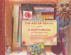
book_cover

Mari has written a delightful book, The Art of Travel With a Sketchbook, which describes her approach. She explains how to make deeper connections to places, cultures, and people with simple sketching and observation. It is what happens during the sketching and the memories preserved that are the reward, rather than any specific artistic result.

The large pages of this concise volume are bursting with color. Subtitled Six Tips to Get Started, these are in fact broad areas which Mari introduces and describes with a variety of tips. Each idea is also demonstrated with lots of work and commentary from the new journalers in her workshops. Their diverse pages feature simple sketches, collage, and colorful backgrounds. It is clear that many have been inspired and moved by Mari’s workshops.

This book would be a great introduction for those new to travel journaling or fun for anyone looking for a fresh outlook or a shot of inspiration. And, I have not taken Mari’s workshop, but it sounds like a lot of fun. In 2008 she will be leading trips in Oregon, France and Mexico.

   Related Article: An Interview with Mari Le Glatin Keis

❀   ❀   ❀

Ashland Oregon Sketchbook   November 18th, 2007

sketch_ashland_main_street
View up North Main Street (larger)

Last month I went to Ashland Oregon for a long weekend of play and relaxation with some women from my book club. It’s the “Bad Girls” book club: you don’t have to read the book if you bring good snacks!

Ashland is a pretty town surrounded by scenic rural areas, and is especially known for it’s almost year round Oregon Shakespeare Festival. We were not able to get tickets for all of the plays we had hoped to see, but we had a great time hanging out, eating out, shopping and talking.

The Fall colors were stunning! The trees were on fire each with their own blast of color: yellow, orange, pink or red. I was able to do some sketching but didn’t fully do those colors justice, I’m afraid. I also had fun sketching from the plane again. That sketch, of course, was drawn mostly from memory.

sketch_ashland_lithia_park_trees
Lithia Park (larger)

sketch_marin_airplane_view
Marin County from the Air (larger)

sketch_ashland_building
Main St. Restaurant (larger)

sketch_cabin
Backyard Cabana (larger)


Sketching in Ashland

❀   ❀   ❀

Doodles in the Dark   November 15th, 2007

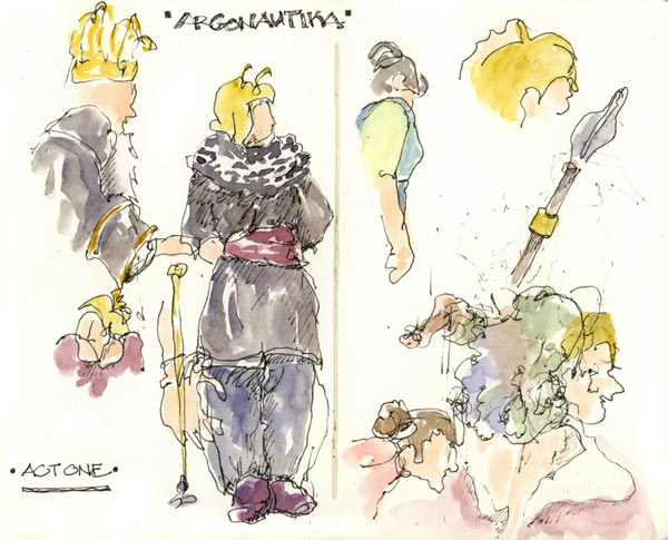
sketch_argonautika_theater_play
Argonautika, Act I (larger)

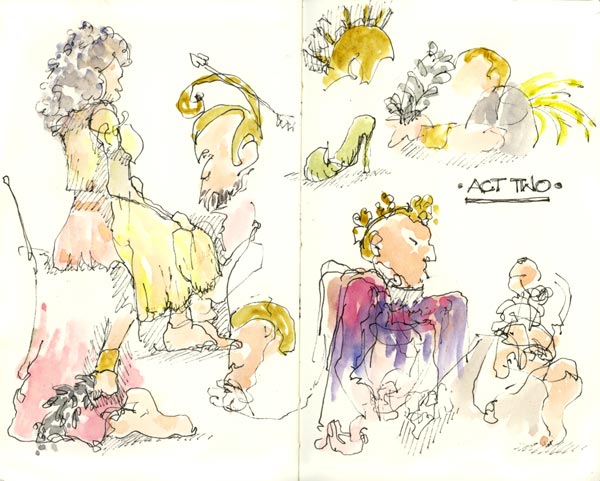
We went to see Argonautika the other night at the Berkeley Repertory Theatre. It was quite good, especially the staging and costumes, and I particularly liked the helmets and crowns. All of their (otherwise) triumphant spikes and spires were frayed or bent and curled as if they’d been deflated – very funny.

I was inspired to draw in the dark which I have done before. I kept running off the paper though and had no idea when my sketches were overlapping. At one point I had my fountain pen upside down and got only faint scratches for my effort. I did add the watercolor paint later though, which helped to pull out the sketches I could recognize.

Not being able to see the paper is unnerving but it’s a great way to practice seeing: an important and often overlooked aspect of drawing. By contour drawing, following the outlines with your eyes as you draw lines on the unseen page, you can train your eye and get some surprising results. Who knew that overlapping sketches could look interesting? It’s a great exercise: try sketching at the next dark performance you go to!

sketch_argonautika_theater_play
Argonautika, Act II (larger)

❀   ❀   ❀

SketchCrawl 16: San Francisco   November 12th, 2007

sketch_alt here
Lunch at MarketBar (larger)

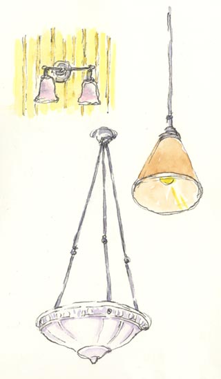
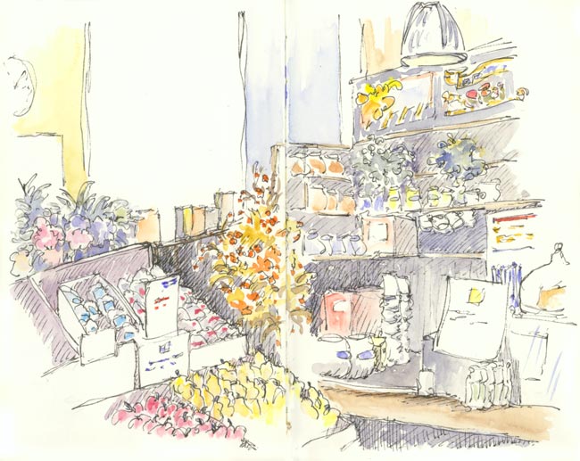
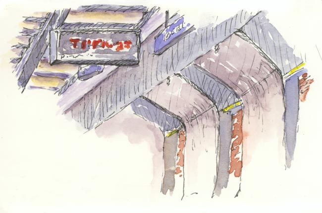
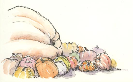
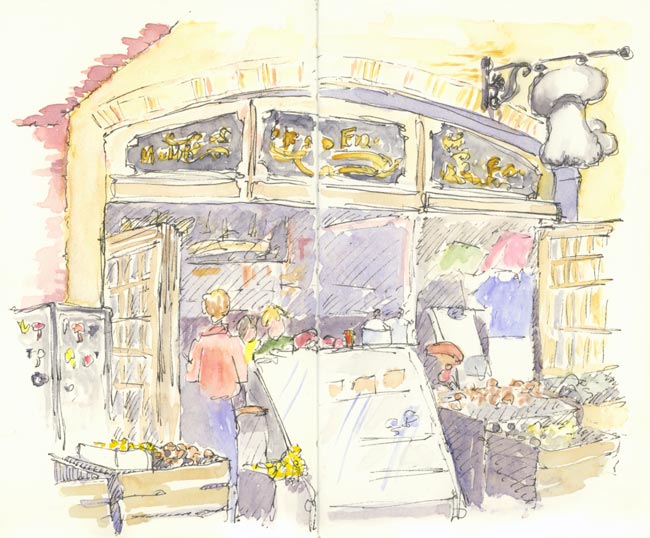
Last Sunday was the 16th SketchCrawl event. My husband and I spent the day in San Francisco sketching and exploring at the Ferry Building. We had a great day!

sketch_lamps_lights
Lamps at Market Bar (larger)

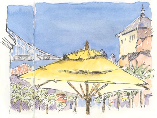
This historic building has been extensively restored and reopened in 2003 as a food-oriented marketplace. It bustles with energy and activity and the architecture and shops are quite striking. It’s a great place to sketch. There are also awesome Bay views and on Saturdays and Tuesdays, a Farmer’s Market.

We also enjoyed a wonderful lunch outside at MarketBar. The weather was just perfect: a gloriously crisp Fall day.

sketch_frog_hollow_farm_store
Frog Hollow Farm: Fruit Stand (larger)

sketch_bart_train_station
Berkeley BART Station (larger)

sketch_pumpkins
Giant Pumpkin (larger)

sketch_mushroom_store
Far West Fungi: Mushrooms Only (larger)

Related:

❀   ❀   ❀

New Mexico 2007 Sketchbook, Part Two: Santa Fe   November 4th, 2007

Continued from: New Mexico Sketchbook, Part One: Taos

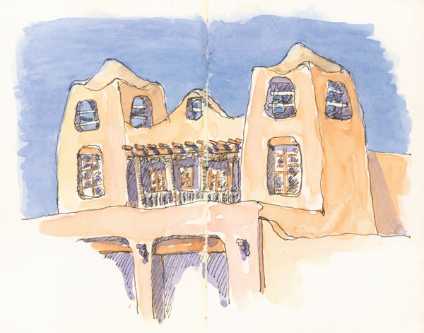
sketch_santa_fe_museum_adobe
New Mexico Museum of Art (larger)

After a couple of days in Taos we headed down to Santa Fe and stopped for lunch at Rancho de ChimayĂł, a rambling, bustling restaurant featuring authentic Northern New Mexico cuisine.

sketch_adobe_building_santa_fe
Adobe House (larger)

We ate well: bright pink prickly pear margaritas, warm sopaipillas with honey, posole, carne adovado, and assorted sauces featuring local chilies. Yum!

Around Town

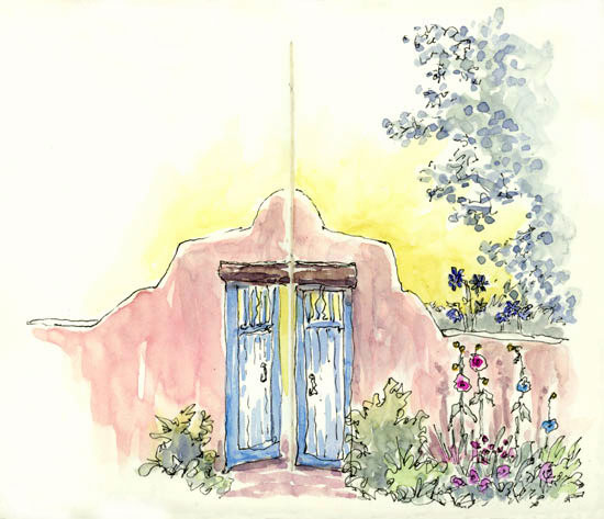
Santa Fe is one of my favorite towns. It is tourist-y to be sure, but the unique aesthetics of the region are not diminished and there are details to savor everywhere. Although it is a somewhat sprawling city the historic area is very walk-able, laid out on a grid around the Santa Fe Plaza. There are other interesting neighborhoods within walking distance as well. And on every block, great sketching opportunities.

sketch_santa_fe_cafe_pasqual
Cafe Pasqual’s (larger)

On one walk I found my dream house; at least from the outside! On a dirt road and walking distance to the center of town, it is a true adobe building with five intriguing doorways. And it was for sale, but no, we didn’t buy it. 🙂

Another favorite restaurant of mine is La Casa Sena. They have tables outside in an enclosed and tree-shaded courtyard. We ate there on a warm breezy evening and it was sublime.

Sketching on the Go

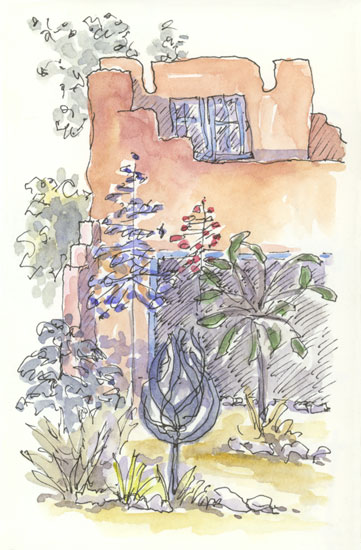
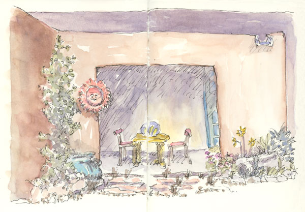
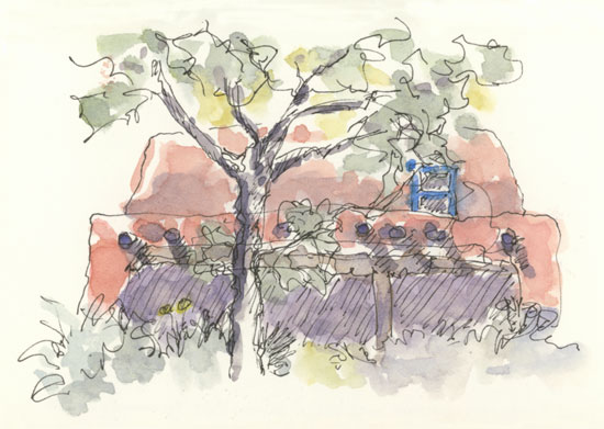
As you can see, there is lots of adobe to draw and paint in Santa Fe! The colors vary dramatically as the light changes. It was fun to mix up each batch of watercolor and try to get it just right. I used the same paint colors as I did in Taos, which worked quite well.

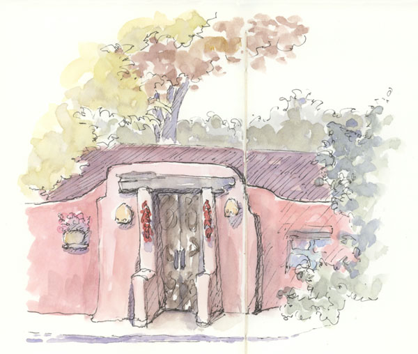
sketch_adobe_wall_gate_santa_fe
Garden Gate (larger)

We were in Santa Fe right after Labor Day and the town was deserted! It was actually a bit eerie, but it was easy to move around, get into restaurants and museums, and to stand on the street working in my sketchbook. As I often do when traveling, I did the ink drawing on site and added the watercolor in the evenings and on the plane ride home.

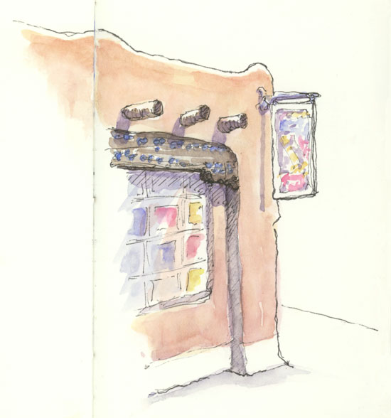
sketch_gallery_canyon_road_santa_fe
Gallery on
Canyon Road
(larger)

I love Northern New Mexico environments, both natural and man-made. Pink-y brown adobe, warm blue details and sky, red chili ristras, and strong Mexican and Indian influences make the built atmosphere very alluring. And, the surrounding desert, subtle in neutrals, pinks and muted grey-greens and -blues, spectacularly sets off mountains and canyon walls with their warm red/orange/pink hues.

The light is special too. In September it was strong and bright: at other times it can be sparkly, almost electric, or fiery and glowing. The light enlivens the scenery and highlights the unique details of this extraordinary landscape.

sketch_santa_fe_fonda_street
Corner San Francisco & Old Santa Fe Trail (larger)

sketch_santa_fe_adobe_house_door
Dream House (larger)

See Also:

❀   ❀   ❀

New Mexico 2007 Sketchbook, Part One: Taos   October 18th, 2007

sketch_taos_harwood_museum
Harwood Museum (larger)

Last month we went with some friends on a wonderful trip to Northern New Mexico to explore and relax. And to sketch, of course. I pulled out my sketchbook on a number of occasions in Taos; I could happily draw there for days. [continued below]

sketch_chama_river_newmexico
Chama River (larger)

sketch_taos_window_new_mexico
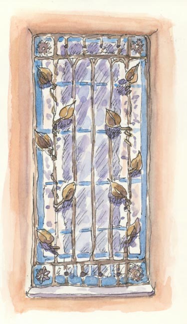
Historic Window (larger)

sketch_taos_storm_new_mexico
Storm Brewing (larger)

sketch_taos_plaza_new_mexico
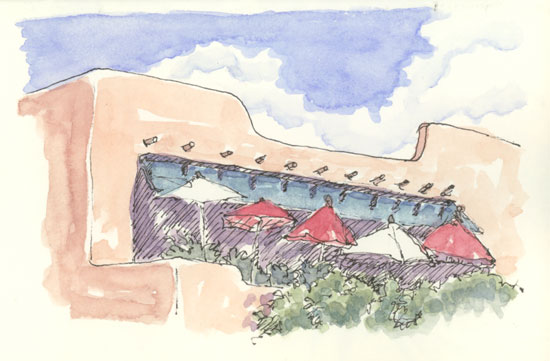
Above Taos Plaza (larger)

I have been to New Mexico several times and I love it. There is something unique and captivating about the colors, shapes, and light of the high desert and the towns there. And the food: oh my!

On our way out of Albuquerque we had the most amazing green chile cornbread at the Gruet Grill. The restaurant does not look memorable from the outside, but all our food was wonderful. I’m still dreaming about that cornbread.

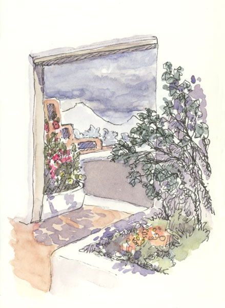
Then we headed up to Taos for a couple of days. There the sky churned with alternating sun and dark storm clouds, adding drama to the views of the mountains beyond. We got caught in two torrential downpours: the biggest I’ve ever seen. Luckily for us they didn’t last long as we had no umbrellas. And, I managed to keep my sketchbook nice and dry.

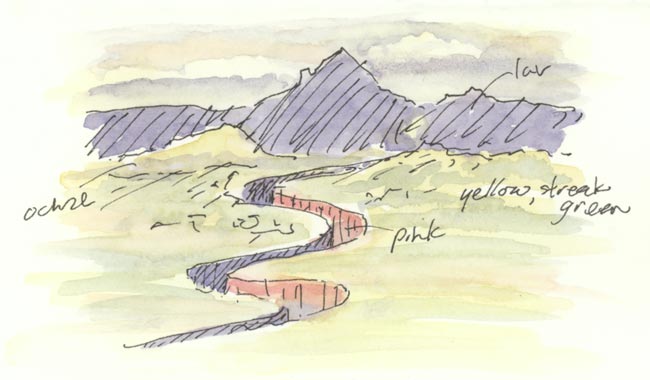
The little sketch of the Chama River, carving it’s way through the valley, was drawn from the car. I noted the colors in ink right on the drawing for painting later. I rather like the effect: similar to what I did in the museum on my New York trip.

My standard paint colors covered most of my needs in New Mexico (for adobe walls and buildings: various combos of Perm. Rose, Burnt Sienna, and Raw Sienna, with sometimes a bit of Ultramarine or Perm. Alizerin Crimson). But trim and other details on adobe buildings is often a warm bright blue so I took along some Manganese Blue as well.

See Also:

❀   ❀   ❀

Sketching from the Air   October 6th, 2007

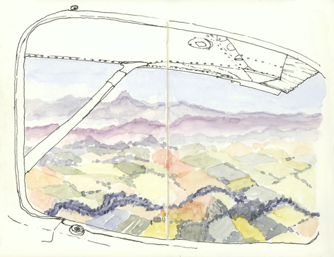
sketch_oregon_view_plane
Over Oregon (larger)

This summer we flew from the Bay Area to Seattle in a small (Cessna 182) airplane. We went with some friends to visit some other friends and had a blast.

On the way up I sat in the back seat of the plane and enjoyed spectacular views of the Cascade Arc volcano peaks strung out all along our route. A lot to capture – I drew the window in ink then decided to try doing the vistas of mid-Oregon in watercolor only. A bit unconventional but I like how it came out.

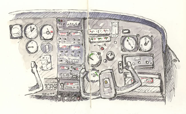
On the way back we spent a lot of time in the clouds at 11,000 feet, so being in the front I sketched the plane’s panel. All the right gauges are there, although they’ve slid around a bit!

sketch_cessna_182_plane_panel
Cessna 182 Panel (larger)

❀   ❀   ❀

Drawing an Unusual Perspective   October 2nd, 2007

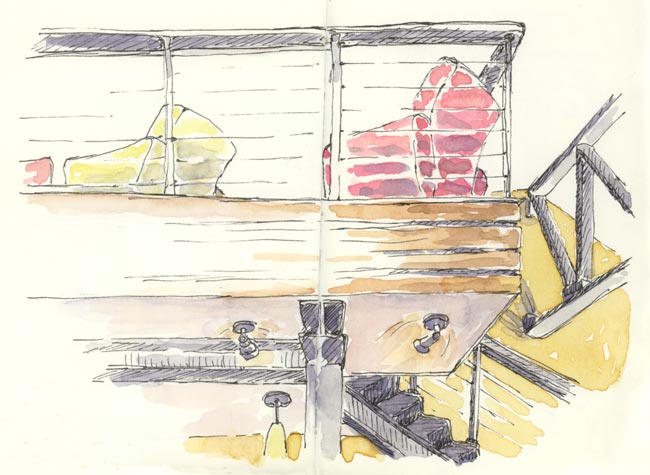
sketch_restaurant_fonda
In Fonda Restaurant (larger)

I couldn’t resist this unusual perspective the other day in Fonda, a bar/restaurant in Berkeley. The interior is striking and the cozy chairs invite one to lie back and enjoy the view. I settled in and, sustained by tasty food and drink, got to work in my sketchbook.

Not only is the view atypical, but the lighting is as well, coming mostly from below. The drawing was a challenge and the painting was quite enjoyable. I really like their brightly colored armchairs and that ochre wall.

❀   ❀   ❀

How I Sketch: Part Two, Demonstration   September 20th, 2007

Continued from: How I Sketch: Part One, Materials

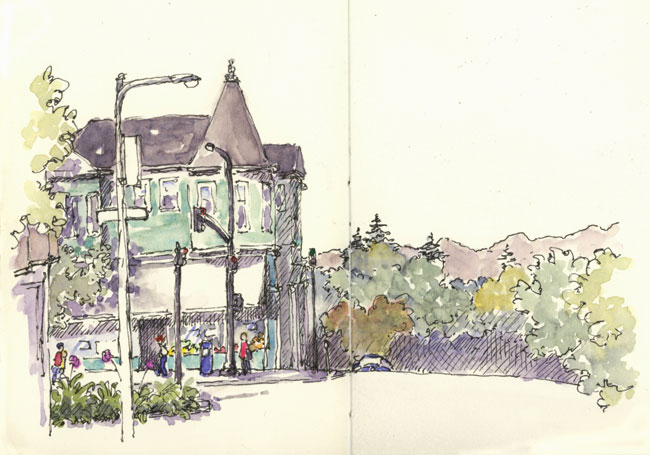
berkeley_corner_shattuck_vine
Demonstration Sketch [larger]

I thought it would be helpful to show and describe my own ‘how to sketch’ step by step process, but keep in mind that what works best for each person will vary widely. There are as many ways to create great sketches as there are artists.

When combined, ink line and watercolor create a lively visual interplay curiously pleasing to the eye. Playing with these two rather different media is a good introduction for those new to sketching: the results are fun, unexpected, and often wonderful.

When possible I do both the drawing and the painting on site. The painting can be done later, if need be, but I strive to complete each sketch on the same day for best results.

Sketches with areas that are not completely defined or finished are especially intriguing. The mind likes to have some work to do to fill in those gaps. To that end, I try to leave areas or portions of objects un-drawn, un-painted, or un-detailed.
berkeley_corner
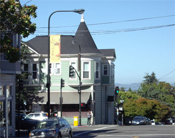
Demonstration Subject [larger]

Demonstration

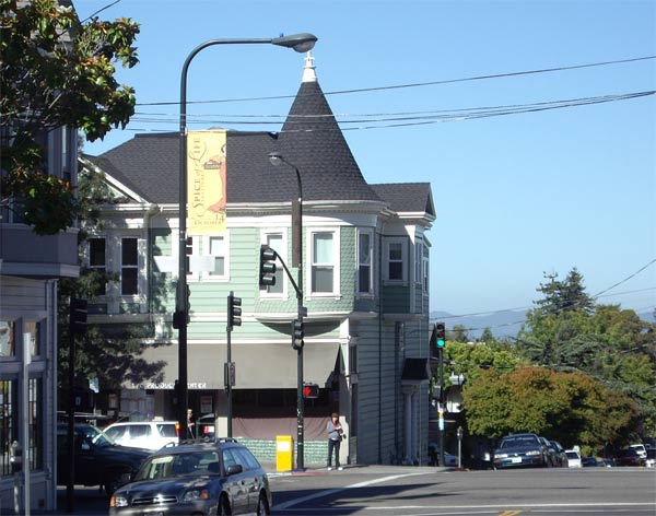
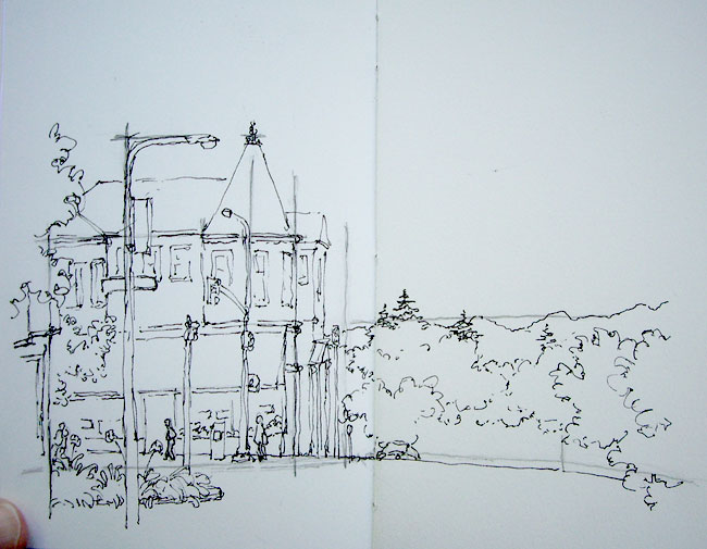
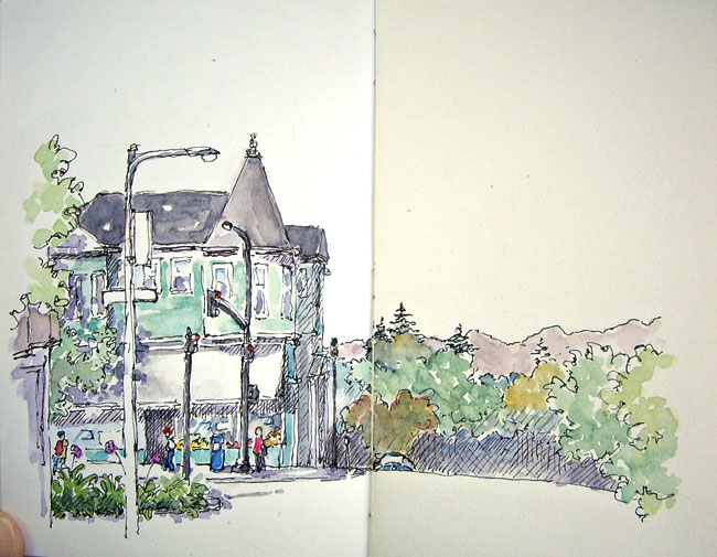
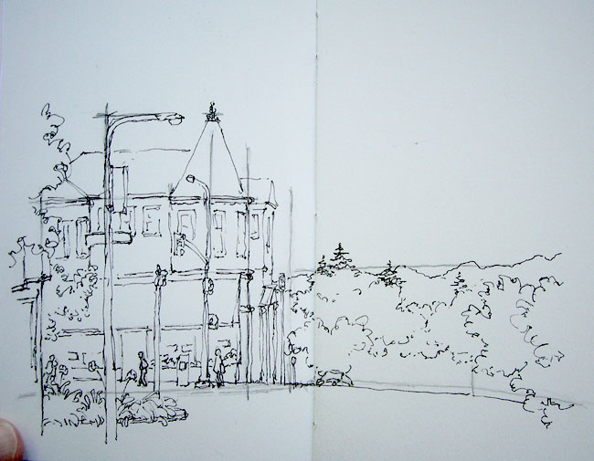
I did this sketch of a North Berkeley street corner (Shattuck Ave. & Vine St.) one morning last month while sitting in my car, taking digital pictures along the way. I have always liked this building, which houses a produce store on the ground floor, but had never sketched it. The lamppost banner also caught my eye; I like to draw scenes with flags, signs and banners. This sketch spans one spread (5″ x 7″) in my sketchbook and took about 30 minutes to complete, roughly split between drawing, painting, and waiting for paint to dry.

Drawing

The drawing is done with a fountain pen and waterproof ink. I try to stay loose; if I don’t like where a line ends up I just draw it again where I’d like it to be. Also, I find that a somewhat interrupted line adds flavor and a sense of light to the scene.

Step 1: Guide Lines

sketch_demo_step_1
Step 1: Guide Lines [larger]

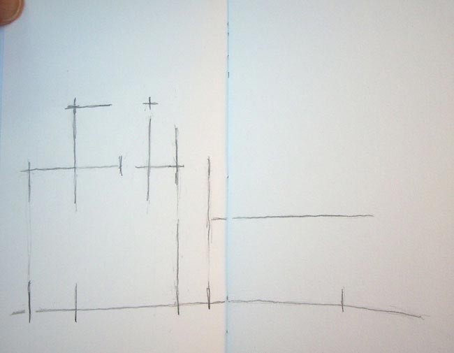
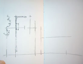
I rarely bother with this step but wanted to show every contingency. When the perspective of a scene is particularly tricky, or if I want to be sure to fit specific objects in a sketch, I will consider starting with some guide lines in pencil.

I take care that the lines are only positional cues and not drafts of the actual drawing; if I end up doing inking over completed pencil lines the results are stiff. I draw the lines lightly: these are shown heavy so you can see them.

Here, the guide lines note the positioning of the main building and its turret roof, the foreground lamppost, the line of the Marin County hills in the distance, and the street level. Streets are horizontal, but I felt like curving this one a bit; it seemed to help indicate that the block in the distance descends out of view.

Step 2: Foreground Objects
sketch_demo_2
Step 2: Foreground Objects [larger]

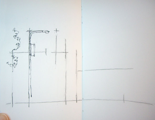
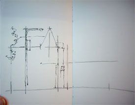
Although I don’t mind background lines occasionally showing through objects in from of them, I generally draw key foreground elements first to minimize this. Note that from my vantage point the tip of the foreground street lamp intersected the top of the turret roof and the top of the post’s banner lined up with the horizontal roofline. Compositionally this is awkward so I drew them with space in between. Artistic license, you see!

Step 3: Outline Main Shapes
sketch_demo_3
Step 3: Outline Main Shapes [larger]

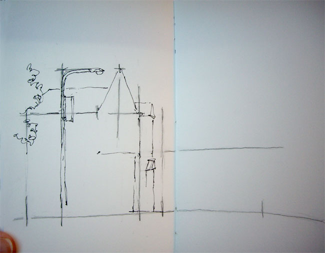
I like to get all of the major shapes blocked in before adding a lot of detail, so that the overall structure of the drawing is established for later reference. Here I outlined the main building and the tricky roof sections using the pencil lines as guides.

Step 4: Fill In Foreground

sketch_demo_4
Step 4: Fill in Foreground [larger]

Next I finished up the objects in the foreground. I like the plants on the median strip, so pulled them more into the view than they actually were and detailed them quite a bit. The building on the left doesn’t add to the scene (although it’s a great clothing store 🙂 ), so I didn’t put in a lot of effort there. I also inked in the line of the street on the left, deciding to curve it even more than I had originally indicated with the pencil guidelines.

Step 5: Details and Background

sketch_demo_5
Step 5: Details and Background [larger]

Once the basic layout of a sketch is established I start to fill in details. I tackled the building itself, working from large areas (upper/lower floors, awning) to smaller (windows, door). Although the blinds of the store were pulled shut, I knew that soon the windows would be filled with colorful produce so I put that in too. The scene seemed barren without any people, so I invented some figures. I also decided that adding a partially visible parked car would help indicate that the street descends out of view.

The background trees and the hills in the distance were then filled in, making sure that the pine trees clearly cross over the line of the hills in the distance to add interest to the skyline.

Step 6: Hatching

sketch_demo_6
Step 6: Hatching [larger]

This step is relatively new for me, but I like the effect. I add hatching to indicate some areas that are in shadow. I do not hatch to indicate dark local color (the color something actually is: navy blue, for example, is a dark color), I just stick to cast shadows (in this sketch for example, under the awning) and the sides of objects that are dark because they are facing away from the light (here, the side of the building). I don’t spend a lot of time on hatching and don’t strive to be too accurate: I just get some in there.

After all the ink has dried (about 3 minutes), I erase my pencil lines.

Painting

Drawing provides structure to the sketches, and watercolor livens them up. I don’t so much paint my sketches though, as I tint them. My colors tend to be on the light side, and muted. This comes from working fast with a small travel palette, mixing pigments, and a lax attitude towards thorough brush and palette cleaning during the painting process. I put down one, and at most two, layers of paint in any one area. The smooth watercolor paper I use to facilitate drawing tends to create sharper paint edges and blotchier washes than traditional paper, but I like these effects.

Working small, I mix my colors on my palette rather than on the paper itself. Water, as needed, comes from my waterbrush. I almost always create a color with two pigments (and maybe a smidge of a third): one pigment is too saturated (except for flowers and manmade objects), and three or more generally creates “muddy” colors, dull and flat.

I don’t try to match the actual colors of things generally, unless color really distinguishes an object. Out of habit I tend to stick to a small number of pigments and mixes.

Typical mixes are:

sketchbooks
  • French Ultramarine+Burnt Sienna: blueish and brownish greys, and a soft black
  • French Ultramarine+Permanent Alizerin Crimson: variety of lavenders (smidge of Burnt Sienna to mute)
  • Cobalt Blue: water or sky
  • Permanent Alizerin Crimson+Burnt Sienna: Brick-like hues
  • Single pigments: Flowers, clothing, other manmade objects
  • Raw Sienna, touch of Permanent Rose, sometimes smidge of Cobalt Blue or Burnt Sienna: Skin tones
  • Raw Sienna: Sunlight on things
  • any blue+any yellow: natural greens

Color theory is a whole topic unto itself, but I follow a general trend of colors moving from warm to cool, saturated to muted and dark to light as they recede into the background.

Painting is done loosely, allowing specks of white paper to show through and both under- and overshooting inked edges. The effect, something like an image printed off-register, adds vitality and sparkle to a line and wash drawing.

Step 7: Foliage

sketch_demo_7
Step 7: Foliage [larger]

What to paint first? I try to pick whatever part of a scene I would like to have for reference when mixing other colors. I might choose the shadow areas, darkest spots, bright (saturated) areas of color, a very particular color I want to recreate, or areas that have colors that need to contrast well with adjoining areas.

In this scene not only is the building green, but there is a lot of green foliage as well; differentiating these is a challenge. One solution would be to make the building a different color, but the color of this building is part of its identity and charm, so I didn’t want to do that. I decided to paint the varying greens of the foliage first to serve as a reference when painting the building. I created a variety of greens using various mixes of French Ultramarine+Aureolin and Cobalt Blue+Aureolin in the foreground and French Ultramarine+Raw Sienna in the background. After the foliage was complete I let it all dry.

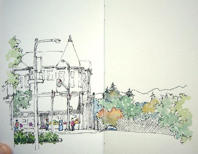
Step 8: Saturated Highlights:

sketch_demo_8
Step 8: Saturated Highlights [larger]

Next I painted snippets of saturated color that I wanted to remain distinctive so that they would not be overshadowed later on. These included the people, newspaper box, flowers, store produce and street lights. I also decided to add redder color to some of the trees.

Step 9: Darks and Shadows

Next I considered the posts and parking meter. I decided to make the post directly in front of the building dark so that it would show well in front of the light building. I wanted to keep the parking meter light since it would be surrounded by dark shadows, and I decided the post beside it should be dark to contrast with the hills and trees beyond. I wasn’t sure about the foreground post, so left it unpainted for the time being. The posts were painted in French Ultramarine+Burnt Sienna grays and let dry.

berkeley_corner
Steps 9, 10 & 11: Shadows,
More Color, and Finishing
[larger]

Sometimes I paint an area’s basic color and then add the shadows on top when the first layer is dry, but more often I just paint the shadows in directly. Here I painted all of the shadows, hatched and un-hatched, except the lacy tree shadows on the building, with French Ultramarine+Alizerin Crimson+smidge of Burnt Sienna.

Step 10: Remaining Color

Next I painted the roof with French Ultramarine+Burnt Sienna. This is a large area in the painting so I made sure to apply it loosely. I did the roof in two coats: an initial pass and then once that dried, a second pass on some areas I wanted darker.

Now to tackle the building. I wanted a green that would be distinctly different from the natural greens in the scene, so I started with a bit of Phthalo Green. This pigment has an artificial hue not found in nature so I never use it for greenery, but it can be good for manmade objects that are green (like awnings and sun umbrellas). However, it is a very intense pigment so I just used a dab of it and added a bunch of French Ultramarine and water. I painted the building as loosely as I could, leaving the framing planks white.

Step 11: Finishing Up

It’s hard to know when to stop. At this stage I thought long and hard about what color to paint the awning. I couldn’t come up with any great ideas, so decided to just leave it unpainted and went ahead and added the lacy tree shadows to the front of the building and awning with French Ultramarine+Alizerin Crimson.

Given my decision regarding the awning, I decided to leave the foreground pole with its banner and sign white as well. Originally I had envisioned that banner being a bright, perky highlight of the sketch and it ended up quite differently, but that’s exactly what happens in the course of making a quick sketch. At any rate, in the spirit of leaving things undone it worked for me. I was pretty sure early on that I was going to leave the street white and that did prove to be true.

And So…

I hope this has been helpful. Lots of great, quite detailed, questions about technique have come my way in response to the first part of this series. I know I have not answered all of them as yet, and will continue to address topics related to both drawing and painting. If you have questions, please let me know, either by commenting here or sending me email, and I’ll do my best to address them.

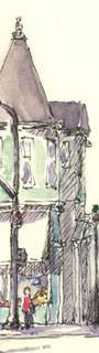
sketch_closeup

Happy Sketching!

See Also

How I Sketch: Part One, Materials
Recent Sketches
Posts on Travel Sketching

❀   ❀   ❀

How I Sketch: Part One, Materials   September 8th, 2007

sketchbook

I am often asked for information on how to sketch, in particular how I do my sketching; the more detailed the better! After much trial I have developed a process that works for me, but I continue to learn and evolve as well. I thought I would describe what I’m currently doing, starting with my favorite materials.

The Kit

After trying virtually every art supply one can buy 🙂 , I finally settled on a stable set of tools. My kit goes everywhere with me so that I can always do a quick sketch when the opportunity arises. To realistically achieve this portability the components must be small. This requirement has largely dictated my choices:

sketchbooks
Sketchbooks

Sketchbook: I do all my sketching in small (“Pocket”, 3.5 x 5 inch) Moleskine notebooks that I rebind with 90lb hot press watercolor paper. I use the thicker (1 inch) “Planner” model because it holds more pages: 44 spreads to be exact. Occasionally a sketch fills only one side of a spread but usually I use the full (7 x 5 inch) page.

For the last few years I have filled at least three books a year. And, I am just finishing up Volume #4 for 2007 right now. Each year on January 1st I always start a new book: it can be a struggle to finish that last book by December 31st!

fountain_pen_nib
Sailor EF Nib

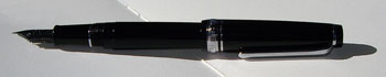
Pen: I use a Sailor fountain pen with an Extra Fine tip, which is made in Japan.

Quality fountain pens have two unique attributes that make them attractive for sketching. The first is the nib’s ball tip, which allows it to glide in all directions with ease. This can help keep the line work looser than that from a pen which favors one direction or needs to be pushed around.

The other important trait is nib flexibility, the extent of which varies in different types of pens. The stroke from a flexible pen changes width in response to the touch of the user creating a lively and personal line.

sailor_fountain_pen
Sailor Fountain Pen

My pen is fairly flexible but what makes it ideal is it’s line weight. Because my sketchbook is small a fine line provides more versatility. Japanese pens run finer than do American or European, and this one draws the thinnest fountain pen line I’ve seen.

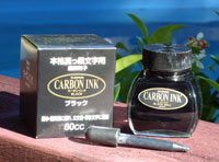
carbon_ink
Carbon Ink

Ink: An ink converter allows the pen to utilize a bottled ink. I use Platinum Carbon Ink, which is a waterproof ink for fountain pens. Waterproof ink does not bleed or run when watercolor washes are laid on top of it. Although such ink is widely considered ruinous for fountain pens, mine have survived thus far. No guarantees though! It is important to use the pen daily to keep the ink flowing and flush it regularly with water to keep it from clogging up. I have found that modern pens stand up to the abuse of waterproof ink better than vintage pens.

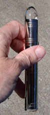
ink_pot
Traveling Ink Pot

Ink Pot: The Visconti Traveling Ink Pot is not cheap, but with it I can refill my fountain pen anywhere. I love it. The “pot” is sort of like a test tube that has a rubber neck at the top with a conical opening. One fits the pen snugly into the opening, turns the whole thing over so that the ink is above the pen, uses the pen’s filling mechanism to draw the ink down into it, and then flips everything back over to remove the pen. The outside stopper is very hard to get off (a good thing!) so I also carry a small piece of latex cut from a disposable glove which I can use to get a good grip on it. This ink pot works with many, but not all, fountain pens.

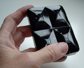
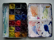
Paint Box: I carry a very small (2 X 3 inch) Winsor & Newton “Bijou” paint box. It has 18 mini pans (1/2 inch square) into which I squirt tube paint. The paint dries quickly (2-12 hours) so it doesn’t run, yet is easily reconstituted with water.

watercolor_paint_box
Paint Box Closed
watercolor_paint_box
Paint Box Open

On the inside lid are four small mixing areas. The metal box is enameled white on the inside which provides a great mixing palette.

This particular box has not been made in some time (current boxes called “Bijou” are different: bigger overall with bigger “half pan” wells) and are hard to find. However, creative folks are hand making similar mini boxes with great success. I love my little box, although it’s taken quite a beating. When it finally gives out I am going to try crafting a replacement. If I change anything, it will be to use even less space for paints and a little more for mixing. I won’t make the box any bigger though!

Paint: I use Winsor & Newton “Artists Quality” watercolor paints in tubes.

Colors I use most often:
  Raw Sienna
Burnt Sienna
French Ultramarine
    Cobalt Blue
Permanent Alizarin Crimson
Permanent Rose
Other colors sometimes used:
  Lemon Yellow
Aureolin Yellow
Scarlet Red
Cobalt Violet
Indigo
    Sap Green
Winsor Blue (Green Shade)
Phthalo Green
Manganese Blue

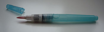
Waterbrush: The brush I use is the Niji waterbrush. It is especially convenient for sketching on the go.

waterbrush
Waterbrush

The soft plastic handle fills with water which is fed down into the brush head from inside as the handle is squeezed. With this brush you don’t need any open water container at all, which allows for painting in many more situations. The handle holds enough water for several sketches and is easily refilled by sink, glass, water bottle, creek, puddle, etc. These brushes come in a blue a clear plastic package and can be found in the US in larger art supply stores or online. Similar brushes are available in Europe and Asia as well.

Paper Towel: To change colors with the waterbrush you simply give it a little squeeze and soak up the water with a paper towel. I carry a piece of paper towel or sturdy napkin for this purpose.

Mechanical Pencil: Rarely used, but if needed I like a pencil that is always sharp.

Mini Eraser: When I do need to erase pencil lines, a soft white eraser is gentle on watercolor paper.

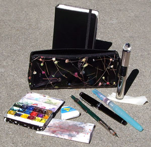
Pencil Bag: I have a typical student’s pencil bag (7 inches long, 3 inches high) that holds everything listed above except the sketchbook.

This little DIY sketching kit has served me well, on travels near and far. In fact, I do all of my sketching with these materials. The bag and sketchbook are very portable and I am able to keep them with me pretty much everywhere I go.

sketching_kit
Portable Sketching Kit

Continued In…

How I Sketch: Part Two, Demonstration

See Also

Moleskine Rebinding Project
Posts on Travel Sketching

❀   ❀   ❀