All Posts On: Landscapes

New Mexico 2007 Sketchbook, Part Two: Santa Fe   November 4th, 2007

Continued from: New Mexico Sketchbook, Part One: Taos

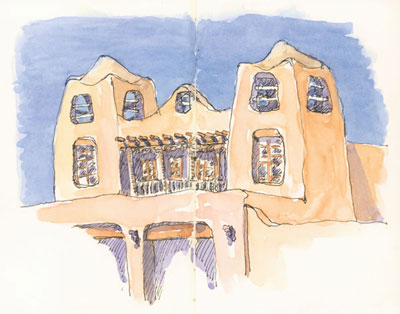
sketch_santa_fe_museum_adobe
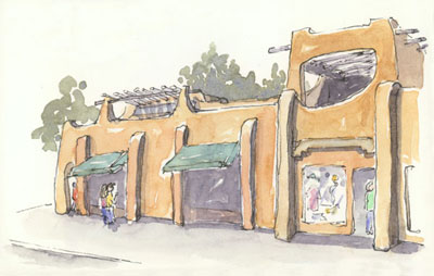
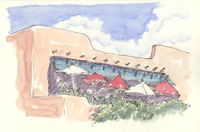
New Mexico Museum of Art (larger)

After a couple of days in Taos we headed down to Santa Fe and stopped for lunch at Rancho de Chimayó, a rambling, bustling restaurant featuring authentic Northern New Mexico cuisine.

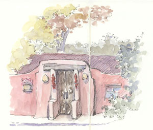
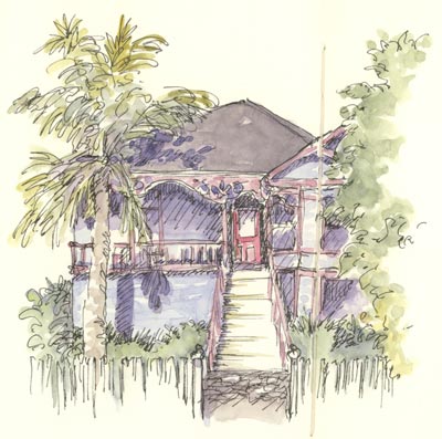
sketch_adobe_building_santa_fe
Adobe House (larger)

We ate well: bright pink prickly pear margaritas, warm sopaipillas with honey, posole, carne adovado, and assorted sauces featuring local chilies. Yum!

Around Town

Santa Fe is one of my favorite towns. It is tourist-y to be sure, but the unique aesthetics of the region are not diminished and there are details to savor everywhere. Although it is a somewhat sprawling city the historic area is very walk-able, laid out on a grid around the Santa Fe Plaza. There are other interesting neighborhoods within walking distance as well. And on every block, great sketching opportunities.

sketch_santa_fe_cafe_pasqual
Cafe Pasqual’s (larger)

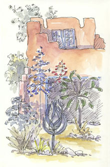
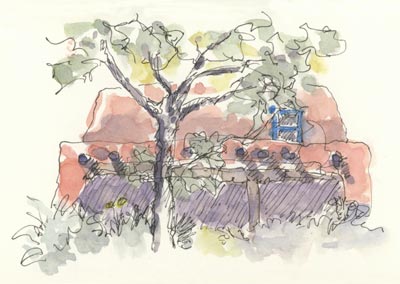
On one walk I found my dream house; at least from the outside! On a dirt road and walking distance to the center of town, it is a true adobe building with five intriguing doorways. And it was for sale, but no, we didn’t buy it. 🙂

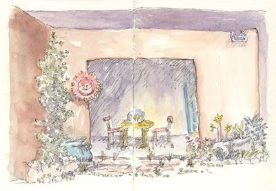
Another favorite restaurant of mine is La Casa Sena. They have tables outside in an enclosed and tree-shaded courtyard. We ate there on a warm breezy evening and it was sublime.

Sketching on the Go

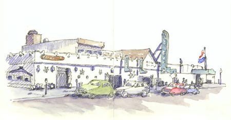
As you can see, there is lots of adobe to draw and paint in Santa Fe! The colors vary dramatically as the light changes. It was fun to mix up each batch of watercolor and try to get it just right. I used the same paint colors as I did in Taos, which worked quite well.

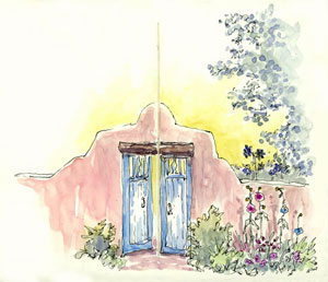
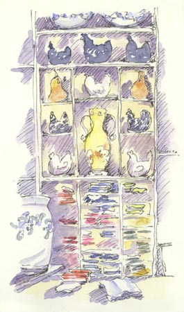
sketch_adobe_wall_gate_santa_fe
Garden Gate (larger)

We were in Santa Fe right after Labor Day and the town was deserted! It was actually a bit eerie, but it was easy to move around, get into restaurants and museums, and to stand on the street working in my sketchbook. As I often do when traveling, I did the ink drawing on site and added the watercolor in the evenings and on the plane ride home.

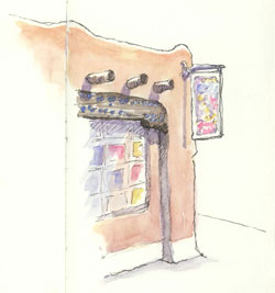
sketch_gallery_canyon_road_santa_fe
Gallery on
Canyon Road
(larger)

I love Northern New Mexico environments, both natural and man-made. Pink-y brown adobe, warm blue details and sky, red chili ristras, and strong Mexican and Indian influences make the built atmosphere very alluring. And, the surrounding desert, subtle in neutrals, pinks and muted grey-greens and -blues, spectacularly sets off mountains and canyon walls with their warm red/orange/pink hues.

The light is special too. In September it was strong and bright: at other times it can be sparkly, almost electric, or fiery and glowing. The light enlivens the scenery and highlights the unique details of this extraordinary landscape.

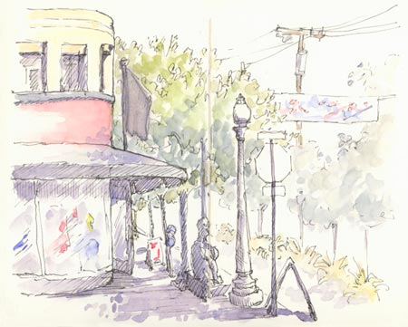
sketch_santa_fe_fonda_street
Corner San Francisco & Old Santa Fe Trail (larger)

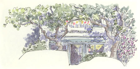
sketch_santa_fe_adobe_house_door
Dream House (larger)

See Also:

❀   ❀   ❀

New Mexico 2007 Sketchbook, Part One: Taos   October 18th, 2007

sketch_taos_harwood_museum
Harwood Museum (larger)

Last month we went with some friends on a wonderful trip to Northern New Mexico to explore and relax. And to sketch, of course. I pulled out my sketchbook on a number of occasions in Taos; I could happily draw there for days. [continued below]

sketch_chama_river_newmexico
Chama River (larger)

sketch_taos_window_new_mexico
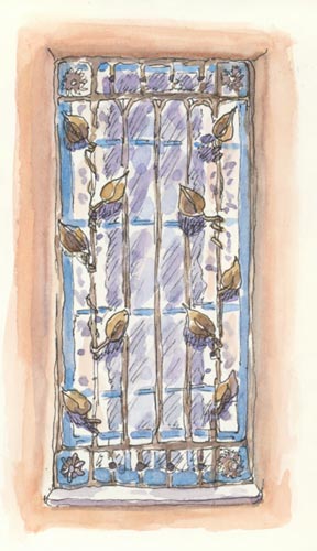
Historic Window (larger)

sketch_taos_storm_new_mexico
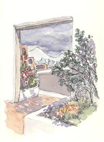
Storm Brewing (larger)

sketch_taos_plaza_new_mexico
Above Taos Plaza (larger)

I have been to New Mexico several times and I love it. There is something unique and captivating about the colors, shapes, and light of the high desert and the towns there. And the food: oh my!

On our way out of Albuquerque we had the most amazing green chile cornbread at the Gruet Grill. The restaurant does not look memorable from the outside, but all our food was wonderful. I’m still dreaming about that cornbread.

Then we headed up to Taos for a couple of days. There the sky churned with alternating sun and dark storm clouds, adding drama to the views of the mountains beyond. We got caught in two torrential downpours: the biggest I’ve ever seen. Luckily for us they didn’t last long as we had no umbrellas. And, I managed to keep my sketchbook nice and dry.

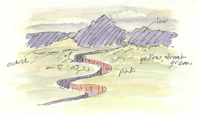
The little sketch of the Chama River, carving it’s way through the valley, was drawn from the car. I noted the colors in ink right on the drawing for painting later. I rather like the effect: similar to what I did in the museum on my New York trip.

My standard paint colors covered most of my needs in New Mexico (for adobe walls and buildings: various combos of Perm. Rose, Burnt Sienna, and Raw Sienna, with sometimes a bit of Ultramarine or Perm. Alizerin Crimson). But trim and other details on adobe buildings is often a warm bright blue so I took along some Manganese Blue as well.

See Also:

❀   ❀   ❀

Sketching from the Air   October 6th, 2007

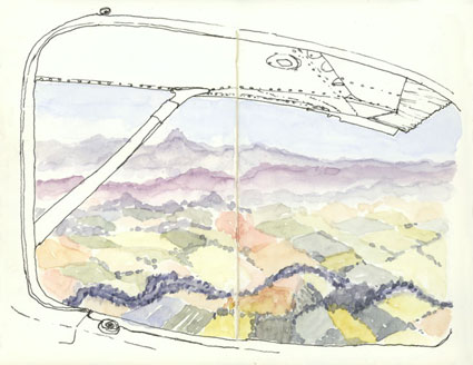
sketch_oregon_view_plane
Over Oregon (larger)

This summer we flew from the Bay Area to Seattle in a small (Cessna 182) airplane. We went with some friends to visit some other friends and had a blast.

On the way up I sat in the back seat of the plane and enjoyed spectacular views of the Cascade Arc volcano peaks strung out all along our route. A lot to capture – I drew the window in ink then decided to try doing the vistas of mid-Oregon in watercolor only. A bit unconventional but I like how it came out.

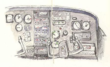
On the way back we spent a lot of time in the clouds at 11,000 feet, so being in the front I sketched the plane’s panel. All the right gauges are there, although they’ve slid around a bit!

sketch_cessna_182_plane_panel
Cessna 182 Panel (larger)

❀   ❀   ❀

How I Sketch: Part Two, Demonstration   September 20th, 2007

Continued from: How I Sketch: Part One, Materials

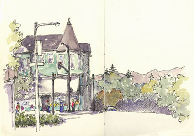
berkeley_corner_shattuck_vine
Demonstration Sketch [larger]

I thought it would be helpful to show and describe my own ‘how to sketch’ step by step process, but keep in mind that what works best for each person will vary widely. There are as many ways to create great sketches as there are artists.

When combined, ink line and watercolor create a lively visual interplay curiously pleasing to the eye. Playing with these two rather different media is a good introduction for those new to sketching: the results are fun, unexpected, and often wonderful.

When possible I do both the drawing and the painting on site. The painting can be done later, if need be, but I strive to complete each sketch on the same day for best results.

Sketches with areas that are not completely defined or finished are especially intriguing. The mind likes to have some work to do to fill in those gaps. To that end, I try to leave areas or portions of objects un-drawn, un-painted, or un-detailed.
berkeley_corner
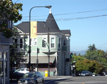
Demonstration Subject [larger]

Demonstration

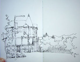
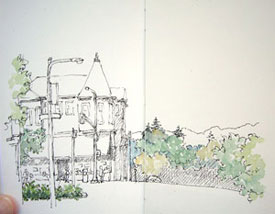
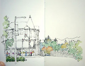
I did this sketch of a North Berkeley street corner (Shattuck Ave. & Vine St.) one morning last month while sitting in my car, taking digital pictures along the way. I have always liked this building, which houses a produce store on the ground floor, but had never sketched it. The lamppost banner also caught my eye; I like to draw scenes with flags, signs and banners. This sketch spans one spread (5″ x 7″) in my sketchbook and took about 30 minutes to complete, roughly split between drawing, painting, and waiting for paint to dry.

Drawing

The drawing is done with a fountain pen and waterproof ink. I try to stay loose; if I don’t like where a line ends up I just draw it again where I’d like it to be. Also, I find that a somewhat interrupted line adds flavor and a sense of light to the scene.

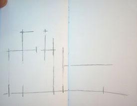
Step 1: Guide Lines

sketch_demo_step_1
Step 1: Guide Lines [larger]

I rarely bother with this step but wanted to show every contingency. When the perspective of a scene is particularly tricky, or if I want to be sure to fit specific objects in a sketch, I will consider starting with some guide lines in pencil.

I take care that the lines are only positional cues and not drafts of the actual drawing; if I end up doing inking over completed pencil lines the results are stiff. I draw the lines lightly: these are shown heavy so you can see them.

Here, the guide lines note the positioning of the main building and its turret roof, the foreground lamppost, the line of the Marin County hills in the distance, and the street level. Streets are horizontal, but I felt like curving this one a bit; it seemed to help indicate that the block in the distance descends out of view.

Step 2: Foreground Objects
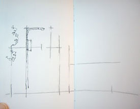
sketch_demo_2
Step 2: Foreground Objects [larger]

Although I don’t mind background lines occasionally showing through objects in from of them, I generally draw key foreground elements first to minimize this. Note that from my vantage point the tip of the foreground street lamp intersected the top of the turret roof and the top of the post’s banner lined up with the horizontal roofline. Compositionally this is awkward so I drew them with space in between. Artistic license, you see!

Step 3: Outline Main Shapes
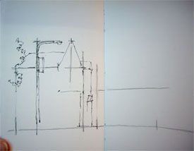
sketch_demo_3
Step 3: Outline Main Shapes [larger]

I like to get all of the major shapes blocked in before adding a lot of detail, so that the overall structure of the drawing is established for later reference. Here I outlined the main building and the tricky roof sections using the pencil lines as guides.

Step 4: Fill In Foreground
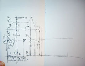
sketch_demo_4
Step 4: Fill in Foreground [larger]

Next I finished up the objects in the foreground. I like the plants on the median strip, so pulled them more into the view than they actually were and detailed them quite a bit. The building on the left doesn’t add to the scene (although it’s a great clothing store 🙂 ), so I didn’t put in a lot of effort there. I also inked in the line of the street on the left, deciding to curve it even more than I had originally indicated with the pencil guidelines.

Step 5: Details and Background
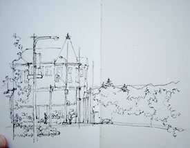
sketch_demo_5
Step 5: Details and Background [larger]

Once the basic layout of a sketch is established I start to fill in details. I tackled the building itself, working from large areas (upper/lower floors, awning) to smaller (windows, door). Although the blinds of the store were pulled shut, I knew that soon the windows would be filled with colorful produce so I put that in too. The scene seemed barren without any people, so I invented some figures. I also decided that adding a partially visible parked car would help indicate that the street descends out of view.

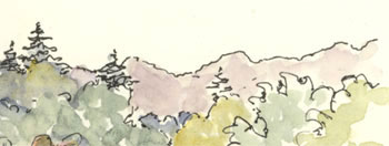
The background trees and the hills in the distance were then filled in, making sure that the pine trees clearly cross over the line of the hills in the distance to add interest to the skyline.

Step 6: Hatching

sketch_demo_6
Step 6: Hatching [larger]

This step is relatively new for me, but I like the effect. I add hatching to indicate some areas that are in shadow. I do not hatch to indicate dark local color (the color something actually is: navy blue, for example, is a dark color), I just stick to cast shadows (in this sketch for example, under the awning) and the sides of objects that are dark because they are facing away from the light (here, the side of the building). I don’t spend a lot of time on hatching and don’t strive to be too accurate: I just get some in there.

After all the ink has dried (about 3 minutes), I erase my pencil lines.

Painting

Drawing provides structure to the sketches, and watercolor livens them up. I don’t so much paint my sketches though, as I tint them. My colors tend to be on the light side, and muted. This comes from working fast with a small travel palette, mixing pigments, and a lax attitude towards thorough brush and palette cleaning during the painting process. I put down one, and at most two, layers of paint in any one area. The smooth watercolor paper I use to facilitate drawing tends to create sharper paint edges and blotchier washes than traditional paper, but I like these effects.

Working small, I mix my colors on my palette rather than on the paper itself. Water, as needed, comes from my waterbrush. I almost always create a color with two pigments (and maybe a smidge of a third): one pigment is too saturated (except for flowers and manmade objects), and three or more generally creates “muddy” colors, dull and flat.

I don’t try to match the actual colors of things generally, unless color really distinguishes an object. Out of habit I tend to stick to a small number of pigments and mixes.

Typical mixes are:

sketchbooks
  • French Ultramarine+Burnt Sienna: blueish and brownish greys, and a soft black
  • French Ultramarine+Permanent Alizerin Crimson: variety of lavenders (smidge of Burnt Sienna to mute)
  • Cobalt Blue: water or sky
  • Permanent Alizerin Crimson+Burnt Sienna: Brick-like hues
  • Single pigments: Flowers, clothing, other manmade objects
  • Raw Sienna, touch of Permanent Rose, sometimes smidge of Cobalt Blue or Burnt Sienna: Skin tones
  • Raw Sienna: Sunlight on things
  • any blue+any yellow: natural greens

Color theory is a whole topic unto itself, but I follow a general trend of colors moving from warm to cool, saturated to muted and dark to light as they recede into the background.

Painting is done loosely, allowing specks of white paper to show through and both under- and overshooting inked edges. The effect, something like an image printed off-register, adds vitality and sparkle to a line and wash drawing.

Step 7: Foliage

sketch_demo_7
Step 7: Foliage [larger]

What to paint first? I try to pick whatever part of a scene I would like to have for reference when mixing other colors. I might choose the shadow areas, darkest spots, bright (saturated) areas of color, a very particular color I want to recreate, or areas that have colors that need to contrast well with adjoining areas.

In this scene not only is the building green, but there is a lot of green foliage as well; differentiating these is a challenge. One solution would be to make the building a different color, but the color of this building is part of its identity and charm, so I didn’t want to do that. I decided to paint the varying greens of the foliage first to serve as a reference when painting the building. I created a variety of greens using various mixes of French Ultramarine+Aureolin and Cobalt Blue+Aureolin in the foreground and French Ultramarine+Raw Sienna in the background. After the foliage was complete I let it all dry.

Step 8: Saturated Highlights:
sketch_demo_8
Step 8: Saturated Highlights [larger]

Next I painted snippets of saturated color that I wanted to remain distinctive so that they would not be overshadowed later on. These included the people, newspaper box, flowers, store produce and street lights. I also decided to add redder color to some of the trees.

Step 9: Darks and Shadows

Next I considered the posts and parking meter. I decided to make the post directly in front of the building dark so that it would show well in front of the light building. I wanted to keep the parking meter light since it would be surrounded by dark shadows, and I decided the post beside it should be dark to contrast with the hills and trees beyond. I wasn’t sure about the foreground post, so left it unpainted for the time being. The posts were painted in French Ultramarine+Burnt Sienna grays and let dry.
berkeley_corner
Steps 9, 10 & 11: Shadows,
More Color, and Finishing
[larger]

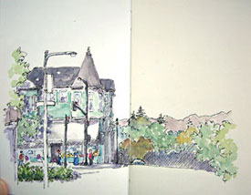
Sometimes I paint an area’s basic color and then add the shadows on top when the first layer is dry, but more often I just paint the shadows in directly. Here I painted all of the shadows, hatched and un-hatched, except the lacy tree shadows on the building, with French Ultramarine+Alizerin Crimson+smidge of Burnt Sienna.

Step 10: Remaining Color

Next I painted the roof with French Ultramarine+Burnt Sienna. This is a large area in the painting so I made sure to apply it loosely. I did the roof in two coats: an initial pass and then once that dried, a second pass on some areas I wanted darker.

Now to tackle the building. I wanted a green that would be distinctly different from the natural greens in the scene, so I started with a bit of Phthalo Green. This pigment has an artificial hue not found in nature so I never use it for greenery, but it can be good for manmade objects that are green (like awnings and sun umbrellas). However, it is a very intense pigment so I just used a dab of it and added a bunch of French Ultramarine and water. I painted the building as loosely as I could, leaving the framing planks white.

Step 11: Finishing Up

It’s hard to know when to stop. At this stage I thought long and hard about what color to paint the awning. I couldn’t come up with any great ideas, so decided to just leave it unpainted and went ahead and added the lacy tree shadows to the front of the building and awning with French Ultramarine+Alizerin Crimson.

Given my decision regarding the awning, I decided to leave the foreground pole with its banner and sign white as well. Originally I had envisioned that banner being a bright, perky highlight of the sketch and it ended up quite differently, but that’s exactly what happens in the course of making a quick sketch. At any rate, in the spirit of leaving things undone it worked for me. I was pretty sure early on that I was going to leave the street white and that did prove to be true.

And So…

I hope this has been helpful. Lots of great, quite detailed, questions about technique have come my way in response to the first part of this series. I know I have not answered all of them as yet, and will continue to address topics related to both drawing and painting. If you have questions, please let me know, either by commenting here or sending me email, and I’ll do my best to address them.

sketch_closeup

Happy Sketching!

See Also

How I Sketch: Part One, Materials
Recent Sketches
Posts on Travel Sketching

❀   ❀   ❀
SketchCrawl 15: Berkeley   August 30th, 2007

sketch_berkeley_spengers
Spenger’s Restaurant [larger]

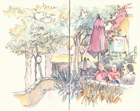
Last Saturday, August 25th, was the SketchCrawl #15 event. If you are not familiar with SketchCrawl, you can read all about it here. It’s a great concept: people sketch together in locations all over the world and share the results online. The idea is to get you sketching and it sure does!

sketch_berkeley_store
In Sur la Table [larger]

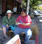
I joined the Berkeley group: eleven intrepid sketchers crawling the 4th Street commercial district. We found good subjects to sketch including street musicians, buildings old and new, storefronts, people milling around and hanging out and even a snake and reptile store.

Jana and I sketched together and it was great fun. I wanted to do a number of sketches but spent a lot of time talking to everyone 🙂 , so ended up inking my sketches on site and adding the color later that evening and the next day.

At the end of the day we gathered at Brennan’s and shared sketchbooks over Irish Coffees. It was a blast and so inspiring! If there is one thing I like better than sketching it’s the opportunity to see other peoples’ sketchbooks. It was great to meet new sketchers including Pete, who’s sketchblog I have long followed and admired, and to see friends Jana, Doña and Vern and family once again.

Fabulous sketches were done by the group, many of which can be seen here. And you can view other sketches done all over the world that day right here.

sketch_berkeley_house_palm_tree
House on 5th Street, Palm Tree [larger]

sketch_berkeley_street_corner
4th and Hearst [larger]

sketch_berkeley_storefront
Down Home Music [larger]

sketch_berkeley_peets_coffee
Peets Coffee [larger]

Some Photos of our Day:


Related:

❀   ❀   ❀
New York Sketchbook, 2007, Part Two   July 28th, 2007

Continued from: New York Sketchbook 2007, Part One

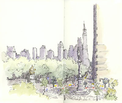
sketch_ny_central_park_columbus_circle
Columbus Circle (larger)

I spent three days in New York on a solo SketchCrawl, following my nose and travel sketching all the way. It was unseasonably hot, and so muggy that even the locals were whining :). The weather somewhat curtailed my extensive walking plans but I still got quite a bit of exploring in.

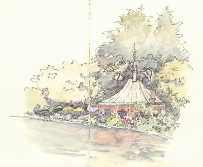
I am especially enamored with Central Park. I drew the Columbus Circle scene while enjoying a scrumptious lunch (and air conditioning) at Bouchon Café, located in the Times Warner Building, suspended in an atrium with a huge glass wall looking down on the scene. Later, a barbershop quartet serenaded me as I sat in dappled shade and sketched the Model Boat Pond.

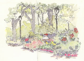
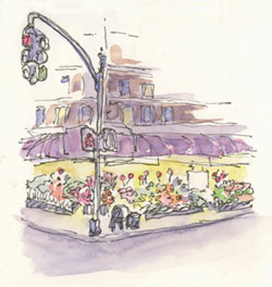
The Tudor City Greens is a small park near the World Trade Center that reminded me of small parks I saw on my Paris trip last year. On a wet, warm night I came across the “Second Avenue Farm”, a corner produce shop (2nd Ave & 50th) and couldn’t resist a quick sketch, even though I was being rained on 🙂 . (continued below)

sketch_ny_central_park
Model Boat House, Central Park (larger)

sketch_ny_tudor_park
Tudor City Greens (larger)

sketch_ny_produce_store
Second Avenue Farm (2nd Ave & 51st) (larger)

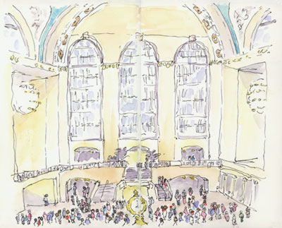
Grand Central Station is buzzing, with way more people than I managed to get into my sketch! It is a beautifully restored Beaux Arts building, and features a gorgeous blue-green ceiling with astronomical constellations in gold. While I was sketching two well dressed business men, clearly strangers, conducting a discreet drug deal right next to me!

I enjoy creating illustrated journals on my travels. Doing so gives purpose to my trips, and also helps allay any guilt I might have about the expenses involved 🙂 . These days I am doing the sketches from the front of the books and some writing backwards from the end of the book. When they meet, it’s on to the next book! On this trip, with only four days for sketching, I managed to completely fill one of my sketchbook journals. This pleases me greatly. I start a new book at the beginning of each year and am now into Volume 4 for 2007.

sketch_ny_grand_central_station
Grand Central Station (larger)

Other posts from this Trip:
     Planes and Trains
     Washington DC Sketchbook, Part One
     Washington DC Sketchbook, Part Two
     New York Sketchbook 2007, Part One
     New York Sketchbook 2007, Part Two

❀   ❀   ❀
Washington DC Sketchbook, 2007, Part Two   July 19th, 2007

Continued from: Washington DC Sketchbook, Part One

sketch_dc_wwII_memorial
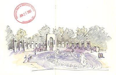
World War Two Memorial (larger)

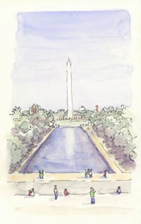
After my stroll through the National Gallery I continued my day by walking the two-mile length of the National Mall. The mall features a series of iconic and monumental American sites, all arranged rather conveniently in a long line. I am not always one for patriotic monuments, but I figured I should visit these once in my life and am glad I did. [cont. below]

sketch_dc_washington_memorial
Washington Memorial (larger)
sketch_dc_lincoln_memorial
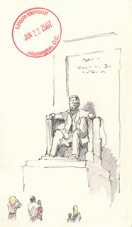
Lincoln Memorial (larger)
sketch_dc_einstein_memorial
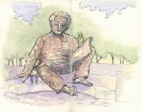
Einstein Memorial (larger)


It was sunny, getting hotter, and quite dry, and I had trouble keeping my watercolor paint wet enough to behave the way I am used to. So, I ended up doing my ink sketching on site and adding the color later. [cont. below]

sketch_dc_union_station
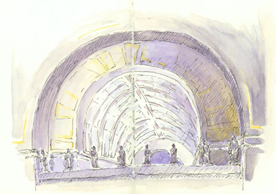
Union Station (larger)

At the Lincoln Memorial I sat on the floor in the back of the viewing area and sketched him between openings in the crowd. There is a sign requesting respectful silence, so of course there was a lot of screaming and running about. And the hot dog stand was a much bigger draw than the Lincoln bookstore. 🙂

It was a hoot throughout the day to listen to the other tourists, mostly families. They say the funniest things and at times I felt like I was in a Simpsons episode 🙂 . One thing about traveling alone is that I am more aware of others around me: how they look and behave, and what they say.

The Einstein Memorial is a wonderful, super-sized (and climbable!) likeness of him, hidden from view in the dappled light of large shade trees. The surface of the sculpture is chunky, as if it had been molded out of clay by the hand of someone even bigger than giant Einstein. This memorial is more casual and inviting than the rest; an interesting contrast to the Lincoln statue and, I must say, more to my taste.

The last sketch was done the next day in Union Station while I waited for a train to New York. The station is a beautiful restored space, warm and light-filled, and even the shopping mall now contained within does not detract from it’s ethereal atmosphere. This sketch shows the ceiling of one of the side alcoves; the main space is even bigger.

Next Up: New York Sketchbook, Part One, On to New York.

All posts from this Trip:
     Planes and Trains
     Washington DC Sketchbook, Part One
     Washington DC Sketchbook, Part Two
     New York Sketchbook, Part One
     New York Sketchbook, Part Two

❀   ❀   ❀
Washington DC Sketchbook, 2007, Part One   July 15th, 2007

sketch_dc_sculpture_garden
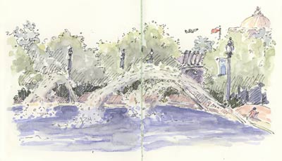
National Sculpture Garden (larger)

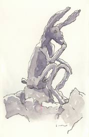
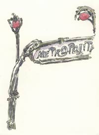
I started a day of sketching in Washington D.C. recently in the National Sculpture Garden, a relaxing place with fountains and plenty of shade trees. Perhaps an odd choice for the US National Sculpture Garden, one of the works is an original Paris Metro gate. There is even an entire café building designed to match! I love the organic, otherworldly lines of these gates, and was happily surprised to find it here. [cont. below]

sketch_dc_sculpture_thinker_flanagan
Thinker on a Rock, Barry Flanagan, 1997 (larger)

sketch_paris metro gate
Paris Metro Gate, Hector Guimard, 1913 (larger)

sketch_dc_calder_mobile
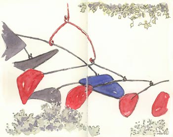
Untitled, Alexander Calder, 1976 (larger)

sketch_ernst_capricorn
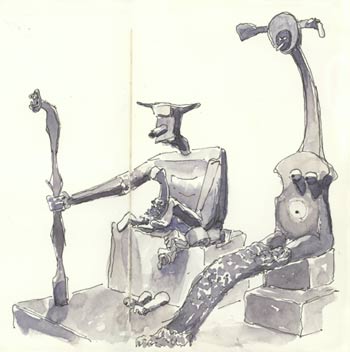
Capricorn, Max Ernst, 1964 (larger)

I then moved on to the National Gallery of Art. Sketching is allowed in pencil only so I added the ink and color to these drawings later on. The Calder Mobile is huge, hangs in a large light filled space, and moves ever so slowly. Fantastic.

The Ernst sculpture sits in the same atrium. Although I liked it immediately, through the process of drawing it I really “got it” so much more. They say that drawing in a museum can greatly facilitate observation and now I understand why. The little details and manner in which this piece is so completely stylized are wonderful. And witty: I was laughing out loud as I drew it. One group came by and pronounced: “it is ugly, we can’t believe that is art, we wouldn’t take it if they paid us”. How original. I however, would love to have it in my front yard and it would look great there too (hint, hint, National Gallery 🙂 ).

All posts from this Trip:
     Planes and Trains
     Washington DC Sketchbook, Part One
     Washington DC Sketchbook, Part Two
     New York Sketchbook, Part One
     New York Sketchbook, Part Two

❀   ❀   ❀

Window Shopping   June 14th, 2007

sketch_shop_window
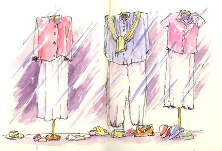
Berkeley Shop Window (larger)

I made this sketch from my car yesterday while waiting for an appointment. It was fun to do!

Shop windows are great to draw: interesting and colorful, and they hold still too 🙂 . I did some others on my recent Pasadena trip and also the one below in Italy, in 2001.

sketch_shop_window_italy
Shop window, Santa Margerita, Italy (larger)

❀   ❀   ❀

Around Berkeley   June 3rd, 2007

sketch_berkeley_public_library
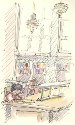
Berkeley Public Library (larger)

Here are a couple of Berkeley sketches I made last Saturday in the downtown area, in between errands. The first is the airy reading room at the public library. The building was beautifully renovated recently, and its art deco roots are well preserved.

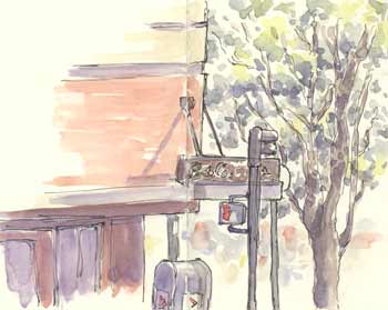
The library doesn’t have a cafe though, and so on to Peet’s Coffee across the street. I grabbed a quick sketch and a quick cappuccino!

sketch_berkeley_peets
Peet’s, Downtown Berkeley (larger)

❀   ❀   ❀

All Over Coffee: the Book   May 28th, 2007

all_over_coffee_cover
Paul Madonna’s All Over Coffee

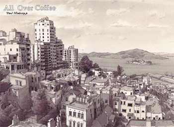
Paul Madonna is an artist in San Francisco who does amazing drawings of local scenes. With a loose but detailed focus he captures the essence of the city so well it’s downright eerie. Snippets of text are added on top of the drawings, and they’re published in the San Francisco Chronicle once a week as All Over Coffee. Now, a wonderful collection of his “strips” has been published.

The drawings are rendered in pen and (often coffee-colored) ink. Crisply edged washes glow with light, and occasionally a spot of color is added. Some scenes are tightly focused, but others take in vast expanses of cityscape such as North Beach and Coit Tower: the very area where SketchCrawl 14 took place last weekend.

Details express the quirky uniqueness of each place. The scenery is always still, no cars or people, but perhaps because of a heightened attention to light and shadow seems to grab a specific moment in time. The text, quirky and provocative bits of conversation or story fragments, adds to this transitory feel.

The book includes 150 strips spanning several years, and it is fascinating to see how Madonna’s style has evolved over time. There is also an extensive essay detailing his writing and drawing methods and how All Over Coffee came to be. The book is published by City Lights, the San Francisco Bookstore & Publisher with a fascinating history of its own.

Find out More:

❀   ❀   ❀

SketchCrawl 14: San Francisco   May 21st, 2007

sketch_filbert_steps
On the Filbert Steps (larger)

On Saturday I joined the San Francisco SketchCrawl group for SketchCrawl 14. I hooked up with fellow art blogger Jana Bouc and we spent the day wandering and sketching. It was great to finally meet her!

The San Francisco group had about 80 people this time; quite a crowd. This SketchCrawl was especially Crawl-y; we walked over four miles. The general route (for us at least) was: Ferry Building, Filbert Steps, Coit Tower, North Beach, Ferry Building. The weather was just about perfect. What a great day!

sketch_peter_paul_cathedral
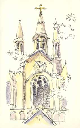
North Beach: St. Peter and Paul Cathedral (larger)
sketch_coit_tower
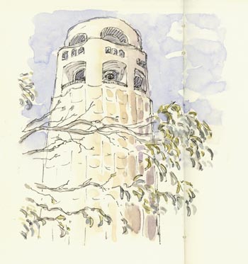
Coit Tower (larger)
sketch_people_coit_tower
SketchCrawlers at Coit Tower (larger)
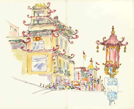
sketch_chinatown
Chinatown: Corner of Grant & California (larger)

Related:

❀   ❀   ❀